 |
| practice in shading for Trompe L'Oeil |
Showing posts with label Value. Show all posts
Showing posts with label Value. Show all posts
Thursday, September 9, 2010
Trompe L'Oeil lesson #1
Trompe L'Oeil is proving to be one of the most difficult things I have ever tried to learn. I have had to start from the basics again. Using shadow and light to create dimension is one of the first things that I had to learn again. It is essential in creating depth. Below is a painting where all I did was try to create an outward tile and the hole it goes in. It is not perfect structurally, but I learned the importance of light and shadow.


Monday, August 2, 2010
2 dimensional design, size/ Value/ Color/Texture
Size is the fourth element in 2d design. In a general sense, if placed side by side and the smaller object does not overlap the larger object, a larger subject will appear to move forward in the picture, and the smaller object will appear to recede. There are several other elements that can reverse this illusion.
The first is value and color. The discord of color are the complimentary colors on the color wheel. ( white/black, Red/green, Blue/Orange, Yellow/ Purple, and all the in between shapes)They are found opposite each other on the color wheel. It also refers to the Value and hue of the color.In general, and yes there are exceptions, warm colors( Red, orange, and yellow) move forward while cool colors ( green blue, and purple recede). Some of the exceptions to this theory deal with the hue of the color. For example if two greens are placed next to each other and one green has been slightly greyed out or dulled by the addition of the complimentary color, it will appear to recede. The greater the value the more forward an object will appear to move. If the smaller object is brighter than the larger object, it will appear to move forward in the composition.
The second is Texture. The discord in Texture refers to smooth and rough textures. Impasto ( thick paint) vs blended. If the smaller object has more texture in it, than it will appear to be in front of the larger object.
The first is value and color. The discord of color are the complimentary colors on the color wheel. ( white/black, Red/green, Blue/Orange, Yellow/ Purple, and all the in between shapes)They are found opposite each other on the color wheel. It also refers to the Value and hue of the color.In general, and yes there are exceptions, warm colors( Red, orange, and yellow) move forward while cool colors ( green blue, and purple recede). Some of the exceptions to this theory deal with the hue of the color. For example if two greens are placed next to each other and one green has been slightly greyed out or dulled by the addition of the complimentary color, it will appear to recede. The greater the value the more forward an object will appear to move. If the smaller object is brighter than the larger object, it will appear to move forward in the composition.
The second is Texture. The discord in Texture refers to smooth and rough textures. Impasto ( thick paint) vs blended. If the smaller object has more texture in it, than it will appear to be in front of the larger object.
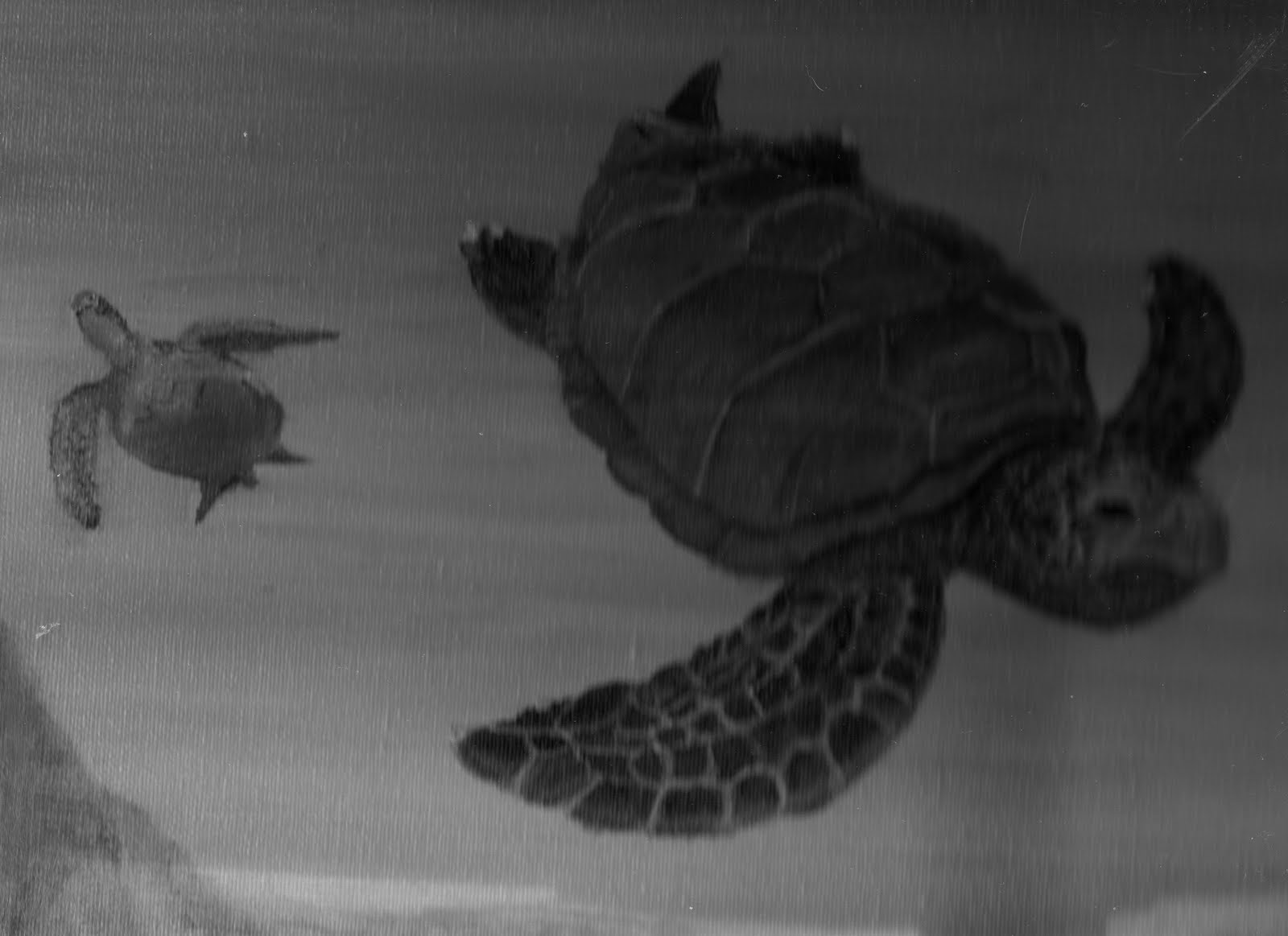 |
| Partial Picture " Sea Turtle Cove" Oil on Canvass by Kimberlie Grady Grey scale Notice how the larger turtle appears to be in front of the smaller turtle In addition to size, notice how the texture of the Larger turtle helps to strengthen this point |
 |
| Partial Picture " Sea Turtle Cove" Oil on Canvass by Kimberlie Grady Notice how the brighter color of the larger turtle places it in front of the greyed out smaller turtle |
 |
| Partial Picture " Sea Turtle Cove" Oil on Canvass by Kimberlie Grady Notice how the rocks in the foreground have more texture than the background The blending out of the background produces distance called Atmospheric ( or in this case water) perspective. Objects in the distance become less defined( less texture and color) Notice also how things in the distance are higher on the painting and closer objects are lower. All of the 7 elements, Line, direction, shape, size, texture, value, and color work together to make a well balanced composition. when creating a composition, consider carefully how each element plays against the others. Plan your compositions before beginning by changing each element. A photo copy machine works well ( or if you are going green a scanner/camera and computer) in experimenting with your composition. This preperation will also make your task more efficent by preserving time and materials ( and frusteration), and it will be more enjoyable. Have fun! The art student All information is subject to change by advisement of my instructors. |
Subscribe to:
Posts (Atom)