Here are some of the Photos- enjoy
The art student


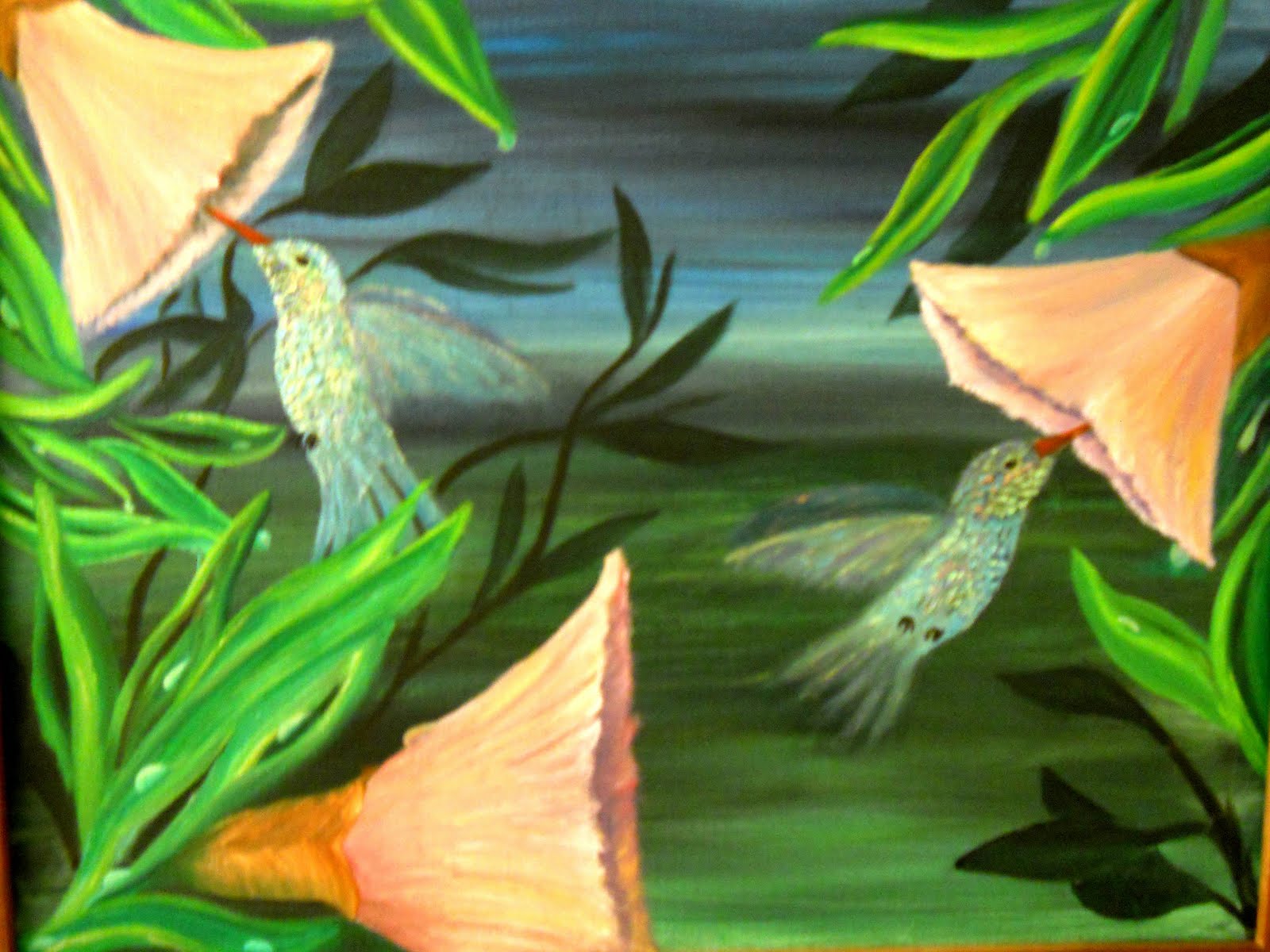 |
| "Hummingbirds at dawn alla prima /painting 2 Oil on canvas by Kimberlie Grady |
 |
| contrast enhanced to show iridescence |
 |
close up to show impasto technique  |
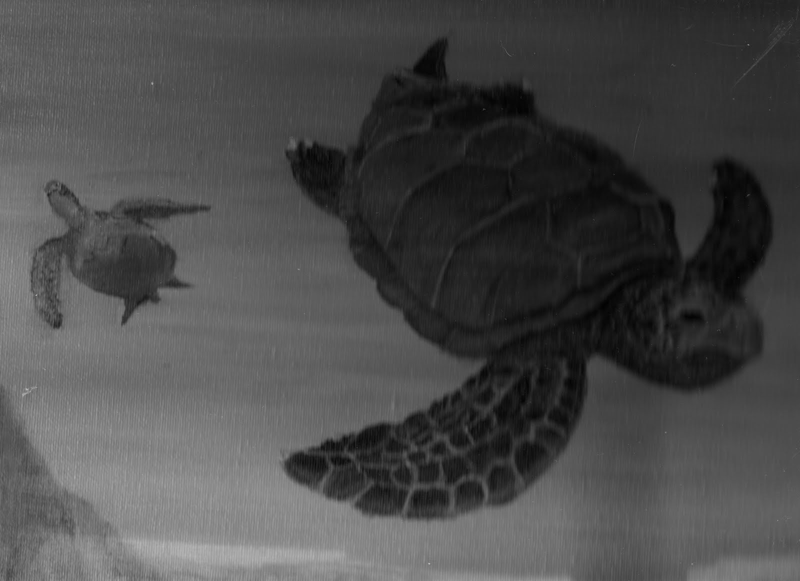 |
| Partial Picture " Sea Turtle Cove" Oil on Canvass by Kimberlie Grady Grey scale Notice how the larger turtle appears to be in front of the smaller turtle In addition to size, notice how the texture of the Larger turtle helps to strengthen this point |
 |
| Partial Picture " Sea Turtle Cove" Oil on Canvass by Kimberlie Grady Notice how the brighter color of the larger turtle places it in front of the greyed out smaller turtle |
 |
| Partial Picture " Sea Turtle Cove" Oil on Canvass by Kimberlie Grady Notice how the rocks in the foreground have more texture than the background The blending out of the background produces distance called Atmospheric ( or in this case water) perspective. Objects in the distance become less defined( less texture and color) Notice also how things in the distance are higher on the painting and closer objects are lower. All of the 7 elements, Line, direction, shape, size, texture, value, and color work together to make a well balanced composition. when creating a composition, consider carefully how each element plays against the others. Plan your compositions before beginning by changing each element. A photo copy machine works well ( or if you are going green a scanner/camera and computer) in experimenting with your composition. This preperation will also make your task more efficent by preserving time and materials ( and frusteration), and it will be more enjoyable. Have fun! The art student All information is subject to change by advisement of my instructors. |