I went to the Botanic gardens today to take some pictures for color studies. 97 degrees and B-U-T-FUL!
Here are some of the Photos- enjoy
The art student
Showing posts with label Art Blog. Show all posts
Sunday, August 22, 2010
Wednesday, August 18, 2010
Perspective the skeleton of Trompe L'Oeil.
In my fall project I have 5 weeks to do research on the history and techniques of Trompe L'oeil. As I am studying, I am finding out that I know very little about the theories and processes of making a trompe L'Oeil painting.
in order to accomplish this art form, a student must have a solid grasp on Linear, oblique, and geographical perspective. in knowing this simple point, i have checked out books on perspective.
Perspective is the backbone of every painting. It is especially important to Trompe L'Oeil because the relies heavily on it's internat structure; it's skeleton, to create the illusion of realism.
In the next 5 weeks I will start writing about the history and Techniques that are required to accomplish this difficult form of painting.
always research and plan your projects,
and have fun
the art student
Thursday, August 5, 2010
FUNNYishstory from class/ epiphony/ / Drawing the face Example
![]() |
1. with a 4h pencil, draw LIGHTLY the basic shape of the face to be drawn. No worries. It will change shape as you measure. |
![]() |
2. Halfway between the top and the bottom of the head will be where the top of the eyes are. |
3.The top of the eyes are at the bottom of the horizontal line. A good estimate to start is to divide the horizontal line into 5ths. The nose and eyes are approx 1/5 of the distance across the face. adjust as you go along. Not all faces are cut from a pattern. |
4. Draw a line where the top of the eyebrow goes. Now measure halfway between the chin and the eyebrow line. This is the bottom of the nose. draw in the tear ducts. From the tear ducts down is the side of the nose. |
![]() |
5. draw in the pupils of the eye. mark the center of the lips. Draw a vertical line straight down to find the corner of the lips. |
![]() |
The ears are placed between the bottom of the nose and the top of the eyebrow. |
![]() |
When I entered drawing 2 I was convinced that there was no way that I would be able to draw a face with any high degree of accuracy.
FUNNYish NOW STORY : The first thing we did in class was to do a 30 minute quick sketch of David. When the instructor critiqued The three of us on our quick sketches he evaluated the person on my right and my left, but did not say anything about mine. I guess if you can't say anything nice- don't say anything at all. HA! Finally I asked. He tried so hard to be positive while showing me how the neck was offset by about ( I don't know) 3 inches! Oh ya, and the eyes were where the forehead should have been. It looked closer to " The scream" - my evaluation ( which is what i wanted to do... run out of the room screaming) than David.
anyway as class went on and I started learning beyond the basics while channeling my drawing 1 instructor's words ( " Draw the shape of the object. Draw the shape of the shadow. Draw the shape of the light. It needs to be darker") and learning new chants ( " Draw what you see. Draw what's there. Read chapter 3. Look at proportions - this lines up with that, If it looks wrong check your perspective, It's looking good- don't screw it up.) Finally the last project came. Drawing the human face. My heart sank like I had just been shot by a silver bullet- animals I can do- Humans- not so much. " Besides" I joked" you said we should draw what we are passionate about, and I don't like people." A good instructor helps you see what you cannot see, so here is what my instructor told me that made all the difference in the world...
You have convinced yourself that you cannot do it.
DING! DING! DING! DING! Dang it! He's right AGAIN!
It is nice when an instructor believes in a student, even when they do not believe in themselves. He sat down with us and gave us a handout on the Cantors ( sp?) of the face. Then he handed us a picture of the lead singer of the doors and had us map them out. Then we drew him free hand. I spent DAYS measuring, drawing, and erasing until it was right. ( results above)
Hope this helps, and have fun with it. If i can do it, so can you
The art student
Wednesday, August 4, 2010
Principles of 2d design/ Repitition and Alternation/ weird song
In previous blogs I generally discussed the elements of 2d design. The elements are what you arrange and include:
Line, Direction, shape, size, texture, value, color, media, technique, simplicity/complexity unity.
In the last blog I discussed what I learned in Drawing 1 about the basics of drawing.
In this blog I am going to go through some of the principles of design.
. OK so instructors, you know you put on all that crazy music right. Here's a weird one for you. http://geekpop.podbean.com/2010/03/12/a-glorious-dawn-cosmos-remix-symphony-of-science/
go down and press play on " Listen Now" or right click on the link below and choose open in a different window and it will play it while you read.
http://geekpop.podbean.com/wp-content/plugins/podpress/podpress_backend.php?podPressPlayerAutoPlay=yes&standalone=yes&action=showplayer&pbid=0&b=45470&id=1004032&filename=http://geekpop.podbean.com/mf/play/i4448/CarlSaganGloriousDawnCosmosRemix.mp3
The first two principles are similar . They are REPETITION and ALTERNATION. If you have had any music theory at all you have learned these principles. Repetition is the absolute repetition of the Rhythm . It's the constant down beat of the bass tone. In art it is the rhythm of repetition of the subject, shape, color or texture. Repetition is also alternation repeated. Picture repetition like this ////////////////////////
Alternation is the periods of tones and silence. It is what makes you want to move to the music. It is the bass, snares, and cymbals together. Alternation includes the subject, shape, color or texture, with spaces in between included.Alternation : / // Repetition : / // / // / //
abstraction " reflective waterfall" acrylic on Canvas paper by Kimberlie Grady notice the repetition of the steps and the alternation of the colors |
Monday, August 2, 2010
Last few points my instructor added in for 2d elements. Media/Technique/simplicity vs. complexity( unity)
Here are three last points that my instructor added to the 7 elements of 2d design.
1. media: The media that you use includes what you apply the media to and with, however the term " media" generally refers to what it is applied with. This will include Pencil ( carbon, graphite, lead, pastel, watercolor, charcoal), paint ( acrylic, oil, water color), ink ( wash, pen and ink). In the partial picture( Below) " Sea turtle cove" the media is Oil paint and is written "Oil on Canvas". Canvas is the second part of media. It describes what the media is applied to. It can include canvas, paper, silk, scratch board, linen, or anything else that it can be applied to.
2. Technique ( unity) : Technique refers to HOW the media is applied. This refers to techniques such as stippling, ink and brush, impasto paint, and ect. Technique also refers to unity. This gradation creates depth through the implication of atmospheric prospective.
3. Simplicity vs Complexity ( unity): In " Sea turtle cove" Impasto pointillism is gradiated into blending is also an example of Complexity gradiating into simplicity. this gradation helps create unity causing the atmospheric prospective to be believable.
In 2d art, all of the elements should be used to create unity in the composition.
Have fun
The art student
all material in this blog is subject to change at the advisement of my instructors.
1. media: The media that you use includes what you apply the media to and with, however the term " media" generally refers to what it is applied with. This will include Pencil ( carbon, graphite, lead, pastel, watercolor, charcoal), paint ( acrylic, oil, water color), ink ( wash, pen and ink). In the partial picture( Below) " Sea turtle cove" the media is Oil paint and is written "Oil on Canvas". Canvas is the second part of media. It describes what the media is applied to. It can include canvas, paper, silk, scratch board, linen, or anything else that it can be applied to.
2. Technique ( unity) : Technique refers to HOW the media is applied. This refers to techniques such as stippling, ink and brush, impasto paint, and ect. Technique also refers to unity. This gradation creates depth through the implication of atmospheric prospective.
![]() |
"Sea turtle Cove" by Kimberlie Grady Oil on Canvas not the complete composition |
In 2d art, all of the elements should be used to create unity in the composition.
Have fun
The art student
all material in this blog is subject to change at the advisement of my instructors.
2 dimensional design, size/ Value/ Color/Texture
Size is the fourth element in 2d design. In a general sense, if placed side by side and the smaller object does not overlap the larger object, a larger subject will appear to move forward in the picture, and the smaller object will appear to recede. There are several other elements that can reverse this illusion.
The first is value and color. The discord of color are the complimentary colors on the color wheel. ( white/black, Red/green, Blue/Orange, Yellow/ Purple, and all the in between shapes)They are found opposite each other on the color wheel. It also refers to the Value and hue of the color.In general, and yes there are exceptions, warm colors( Red, orange, and yellow) move forward while cool colors ( green blue, and purple recede). Some of the exceptions to this theory deal with the hue of the color. For example if two greens are placed next to each other and one green has been slightly greyed out or dulled by the addition of the complimentary color, it will appear to recede. The greater the value the more forward an object will appear to move. If the smaller object is brighter than the larger object, it will appear to move forward in the composition.
The second is Texture. The discord in Texture refers to smooth and rough textures. Impasto ( thick paint) vs blended. If the smaller object has more texture in it, than it will appear to be in front of the larger object.
![]() |
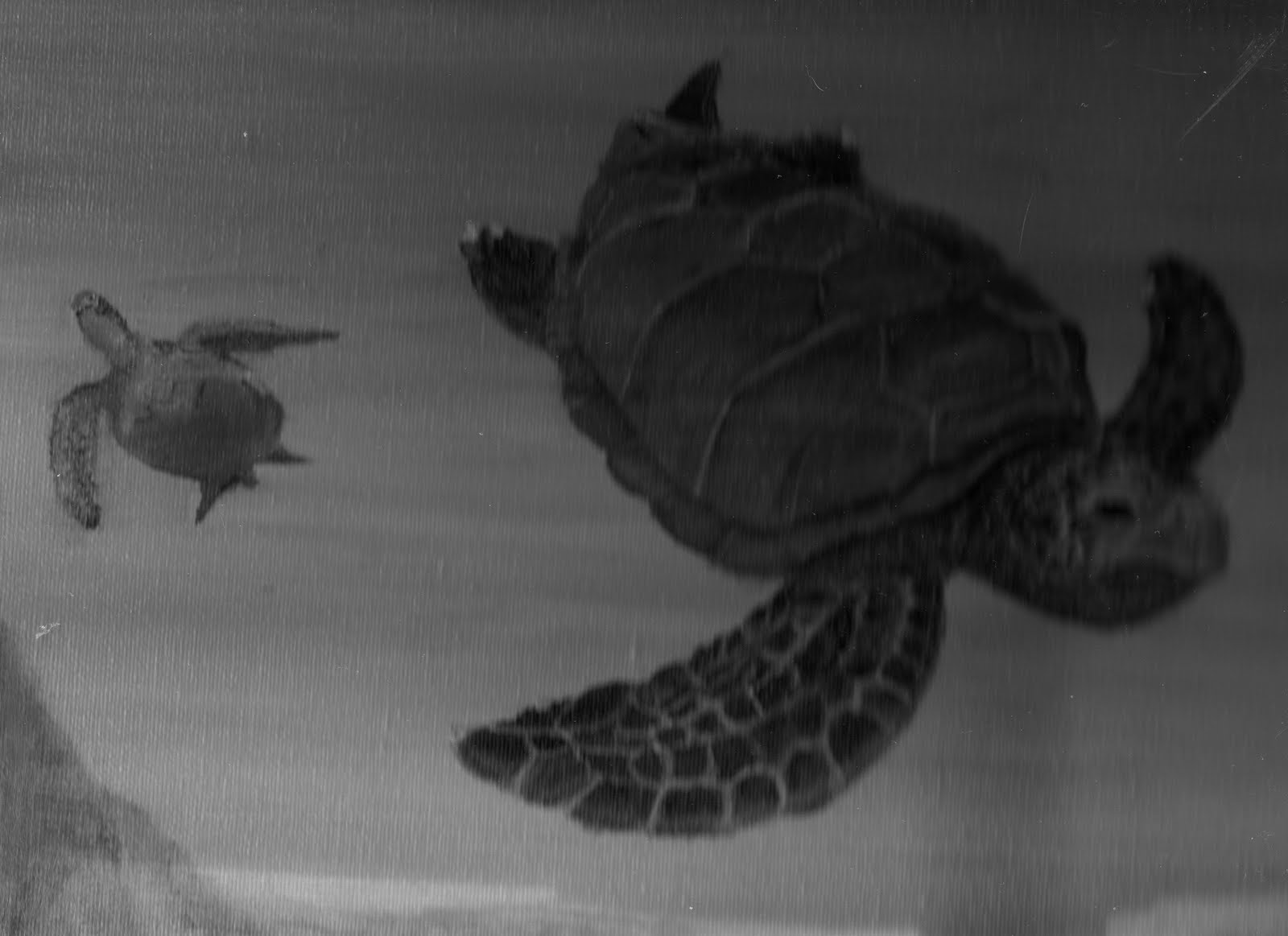
Partial Picture " Sea Turtle Cove" Oil on Canvass by Kimberlie Grady Notice how the brighter color of the larger turtle places it in front of the greyed out smaller turtle |
Labels:
2 dimensional design,
2d art,
2d design,
art,
Art Blog,
Art student's Blog,
Color,
Elements of ART,
size,
Turtle Cove,
two dimensional art,
two diminsional design,
Value
Sunday, August 1, 2010
2d design, element 2 : Direction
Two dimensional design class is more about composition than the subject, or accuracy. When I took it, I was taught that there were 7 elements and 8 principles of design.
The main phrase in this lesson is DISCORD: The highest degree of contrast that can be obtained. ( white/black, large/small, rough smooth)
The second element is Direction:
The two Main discords in Direction are Vertical and horizontal. ( there are other directions such as diagonal). Direction pulls the eye through the picture.
VERTICAL: Gives the impression of strength and power.
Figure 1: partial picture, ink wash on water color paper ( drawing 2, " ancient tree"by Kimberlie Grady ). notice how the tree rises up giving the feeling of aged power.
(DIAGONAL: imply action/movement)
Figure 3 and 4: Partial picture, " hummingbirds at dawn" oil on canvass, grey tones, by Kimberlie Grady. Notice how the hummingbird appears to be moving because of it's diagonal direction. The diagonal lines of the leaves also give movement to the dewdrops.
(LINEAR LINES : pull the eye through the painting) In this picture the diagonal lines of the leaves also produce linear lines directing your eyes to the hummingbird.
I hope that this basic explanation of direction helps.
All information subject to change by suggestion of instructors.
The art student.
The main phrase in this lesson is DISCORD: The highest degree of contrast that can be obtained. ( white/black, large/small, rough smooth)
The second element is Direction:
The two Main discords in Direction are Vertical and horizontal. ( there are other directions such as diagonal). Direction pulls the eye through the picture.
VERTICAL: Gives the impression of strength and power.
Figure 1: partial picture, ink wash on water color paper ( drawing 2, " ancient tree"by Kimberlie Grady ). notice how the tree rises up giving the feeling of aged power.
HORIZONTAL: Gives the impression of peace, tranquility, and restfulness.
Figure2: Partial View " ancient tree" by Kimberlie Grady. Notice how the picture changed from powerful in the vertical view to tranquil in the horizontal view.
(DIAGONAL: imply action/movement)
Figure 3 and 4: Partial picture, " hummingbirds at dawn" oil on canvass, grey tones, by Kimberlie Grady. Notice how the hummingbird appears to be moving because of it's diagonal direction. The diagonal lines of the leaves also give movement to the dewdrops.
(LINEAR LINES : pull the eye through the painting) In this picture the diagonal lines of the leaves also produce linear lines directing your eyes to the hummingbird.
I hope that this basic explanation of direction helps.
All information subject to change by suggestion of instructors.
The art student.
2 dimensional design- Line drawings/shape
Two dimensional design class is more about composition than the subject, or accuracy. When i took it, I was taught that there were 7 elements and 8 principles of design.
The main phrase in this lesson is DISCORD: The highest degree of contrast that can be obtained. ( white/black, large/small, rough smooth)
Elements:
Look for the terms
Mechanical line vs Calligraphic line
Geometric shapes vs Organic shapes
1. Line:

Image 1: Partial image of Kimberlie Grady's drawing 1 midterm " The Great Hall"Notice the geometric shapes.

Subscribe to:
Posts (Atom)